Background
This project is entirely made-up. It started from an idea I had for a project in my visual communication studies, and I went on to expand it to this full project.
I have a really tough time keeping score of my bill situation- I've tried organizing it in my mail inbox, notes, paper, a ring binder- you name it! And always, no matter what, I would forget a pending bill or try to find an old bill with no luck. So I have decided to put a stop to this nonsense!
UX PROCESS
Research & Persona
Target Group Research
50%
Of Israel's population pay every day using digital devices
18-49
Ages of the users who are in the digital paying group
23-49
The final target group- Israelis who pay digitally and have bills to pay in their name.
Persona
Making a persona helps me to identify the users needs and find the app’s weak points.
.png)
Elizabeth Quinn, 26
College Student
Lives in Tel-Aviv, rents an apartment with two other female students. Elizabeth is responsible for paying the bills and always forgets them. Has receives late payments notice numerous times.
BIO
NEEDS & WANTS
Needs a way to organize the apartments bills in one place, and also something to remind her about pending bills so she wouldn’t be late to pay them.
FAVORITE APPS


UX PROCESS
Wireframes
The wireframes represent a single flow of the app, the most important one in my view- the process of paying a new bill. This is because it is the main action a user would want to do, and if this action isn't simple and usable, the user would simply give up.
This part of the process helps me gain insights into the data structure, hierarchy, and applying UX design principles (Fitt’s Law for example).


UI PROCESS
Typography & Colors
TYPEFACE
Raleway
Light Regular Bold
COLOR PALETTE
Inspired by the color green- the color associated with money and finance procedures, but a more modern green to fit the more modern users. Combined with the bright teal color, this helps the user identify the app as a financial one and yet young and progressive.
# GRADIENT
# 45F5F2
# 3FDFAE
# F7F7F7
# 262626
LOGO
I've created a new logo in the concept of overall synchronization- from beginning to end.

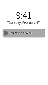
HOMEPAGE
Important data - first!
The homepage is designed so that the most immediate and important data- the pending bills- are displayed first. After that the user can see their monthly bill-state or go in to the history and app settings.
Also, I have kept extra notice of usability heuristics, because of the large target group, trying to keep it simple to understand and use.
THE PAYING PROCESS
Keeping it simple
As mentioned above, because of the wide target group, I wanted to create the most simple paying process, so the user won't get frustrated and give up.
View your bill & compare
View & Save the receipt


Enter Paying information
